
Black Monday: How unlikely was it, and could it happen again? (Part II)
This post is the second in a series that will look back on the events of Black Monday, which happened 30 years ago today, and explore how it might be relevant to contemporary investing. Click here to read the first post.
Looking at the normal distribution we've calculated, versus the actual distribution of returns, gives a clue as to what might have gone wrong with our first prediction of how unlikely Black Monday was:
plot(density(sp500.hist.ret),xlim=c(-0.04,0.04),xlab="",ylab="",
     main="S&P 500 actual vs. fitted distribution of returns")
x.range <- seq(-0.05,0.05,0.001)
points(x=x.range,
       y=dnorm(x.range, mean=sp500.hist.mu, sd=sp500.hist.sd),
       type="l", col="red")
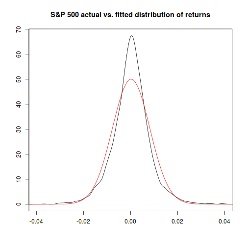
Hmm. It looks like the normal distribution is an OK, but not a great, fit to the actual observed one.1
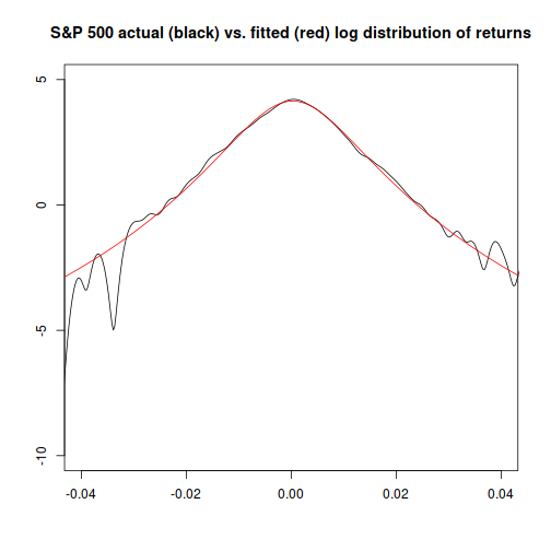
And, if we plot the log of probability for each distribution, we can see that the relative difference between them is largest at extreme values:
plot(x=density(sp500.hist.ret)$x,y=log(density(sp500.hist.ret)$y),
     xlim=c(-0.04,0.04),ylim=c(-10,5),xlab="",ylab="",
     main="S&P 500 actual (black) vs. fitted (red) log distribution of returns",type="l")
points(x=x.range,y=log(dnorm(x.range, mean=sp500.hist.mu, sd=sp500.hist.sd)), type="l", col="red")
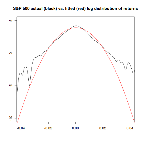
Since we're trying to determine what the probability is at an extreme value, the fact that the normal distribution becomes an increasingly worse fit for more extreme values is a big problem. This is a reason why quants are often warned against blind use of the normal distribution: it can give you bad answers just when you can least afford them.2
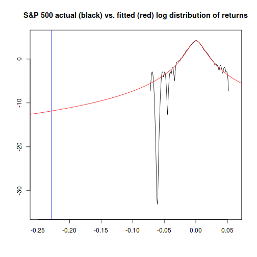
The chart above is truncated; here's a version with a vertical line (in blue) showing the cutoff we're interested in for Black Monday:
plot(x=density(sp500.hist.ret)$x,y=log(density(sp500.hist.ret)$y),
     xlim=c(-0.25,0.06),ylim=c(-35,5),xlab="",ylab="",
     main="S&P 500 actual (black) vs. fitted (red) log distribution of returns",type="l")
x.range <- seq(-0.27,0.08,0.001)
points(x=x.range,y=log(dnorm(x.range, mean=sp500.hist.mu, sd=sp500.hist.sd)), type="l", col="red")
abline(v=sp500.bm.ret,col="blue")
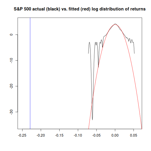
It seems obvious that at extremes on the level of Black Monday's return, the actual probability is going to differ dramatically from the probability given by a normal distribution. Is there a better alternative?
Yes. The Student-t distribution is related3 to the normal distribution, but has significantly thicker “tails”, whose size can be tuned.
The formula for it is:
 = \frac{\Gamma(\frac{\nu + 1}{2})}{\Gamma(\frac{\nu}{2})\sqrt{\frac{1}{2}\tau\nu\sigma^2}} \left(1+\frac{1}{\nu}\left(\frac{x-\mu}{\sigma}\right)^2\right)^{-\frac{\nu+1}{2}}")
and while the normal distribution has two parameters (mean and standard deviation) the Student-t has three: location (μ), scale (σ)4, and degrees of freedom (ν).
Fitting this distribution to the data, we get the following parameter values:
library(MASS)
dnst <- function(x, l, s, df) {return(dt((x-l)/s, df)/s)}
nst.pars <- fitdistr(x=sp500.hist.ret,
                     densfun=dnst,
             start=list(l = 0, s = 0.01, df=5))$estimate
nst.pars
##            l            s           df
## 0.0002711256 0.0059814651 4.5297086007
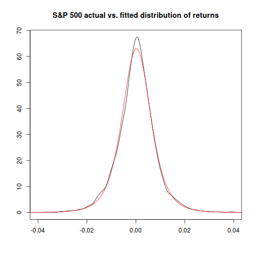
…and now, comparing the theoretical distribution to the actual, things look much closer, particularly at the extremes:
plot(density(sp500.hist.ret),
             xlim=c(-0.04,0.04),xlab="",ylab="",
             main="S&P 500 actual vs. fitted distribution of returns")
x.range <- seq(-0.05,0.05,0.001)
points(x=x.range,y=dnst(x.range, l=nst.pars["l"],s=nst.pars["s"],df=nst.pars["df"]),
       type="l", col="red")
plot(x=density(sp500.hist.ret)$x,y=log(density(sp500.hist.ret)$y),
     xlim=c(-0.04,0.04),ylim=c(-10,5),xlab="",ylab="",type="l",
     main="S&P 500 actual (black) vs. fitted (red) log distribution of returns")
points(x=x.range,
       y=log(dnst(x=x.range,l=nst.pars["l"],s=nst.pars["s"],df=nst.pars["df"])),
       type="l", col="red")
Similarly to how we did things with the normal distribution, we can now determine how likely an event like Black Monday was, given that returns for the market are Student-t distributed, using the desired cutoff value. (-0.22 or -22%)
plot(x=density(sp500.hist.ret)$x,y=log(density(sp500.hist.ret)$y),
     xlim=c(-0.25,0.06),ylim=c(-35,5),xlab="",ylab="",
     main="S&P 500 actual (black) vs. fitted (red) log distribution of returns",type="l")
x.range <- seq(-0.27,0.08,0.001)
points(x=x.range,y=log(dnst(x.range, l=nst.pars["l"],s=nst.pars["s"],df=nst.pars["df"])),
       type="l", col="red")
abline(v=sp500.bm.ret,col="blue")
pnst <- function(q, l, s, df) {return(pt(as.numeric((q-l)/s), df))}
1/pnst(q=sp500.bm.ret,l=nst.pars["l"],s=nst.pars["s"],df=nst.pars["df"])
## [1] 2757592
So, if we assume that S&P 500 returns are Student-t distributed, we would expect an event at least as extreme as Black Monday every 2,757,592 trading days, or once in about 11,000 years. This answer seems a lot more reasonable than the once every 4.03 × 10181 trading days result we got assuming a normal distribution: the Student-t-based model says that Black Monday was very, very unlikely, but not impossible.
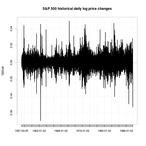
While this estimation method certainly seems to work better than the normal distribution assumption, it still has some issues. For one thing, both the normal and Student-t approaches assume that the market's distribution of risk is constant. But looking at a chart of daily returns, it definitely looks like there are some periods with higher volatility and some with lower:
chart.TimeSeries(xts(sp500.hist.ret,
                     index(sp500.hist)[2:length(index(sp500.hist))]),
                 main="S&P 500 historical daily log price changes")
It turns out you can model this too… click to the next article to see how.
1: You're probabily familiar with seeing actual distributions plotted as histograms. Here, I've plotted the actual distribution of returns as a kernel density estimator instead. One advantage they have is that they're continuous, which can make them easier to compare with theoretical distribtions. See this link for an overview.
2: The normal distribution is not always a bad choice - it depends on what you're doing.
3: Specifically, as the degree-of-freedom parameter approaches infinity, the Student-t distribution approaches the normal distribution.
4: Careful - the scale parameter in the Student-t distribution is similar to, but not the same as the normal distribution's variance parameter!